The Alfa Romeo badge is one of the most storied emblems in motoring — and one of the few that has carried the same two symbols for more than a century. On the left, the red cross of Milan; on the right, the Biscione, the crowned serpent of the Visconti dynasty that once ruled the city. How those two halves came together, and how the badge changed around them, is really the story of Alfa Romeo itself.
1910: The original A.L.F.A. roundel
When the company was founded in Milan on 24 June 1910 as A.L.F.A. (Anonima Lombarda Fabbrica Automobili), it needed a crest. According to company lore, the young draughtsman Romano Cattaneo sketched the design while waiting for a tram at the Porta Ticinese, where the Visconti serpent looked down from the architecture. He paired it with the red-on-white cross from Milan’s own coat of arms, set both inside a circular border, and added the words “ALFA” and “MILANO” separated by two ornamental knots of the House of Savoy, Italy’s then-ruling dynasty.
1920s: Alfa Romeo — and a laurel wreath
After the industrialist Nicola Romeo took control of the company, it was renamed Alfa Romeo in 1920, and the badge was updated to read “ALFA-ROMEO MILANO.” The most famous addition came in 1925: a laurel wreath was wrapped around the emblem to celebrate the P2’s victory in the inaugural Automobile World Championship — a crown the badge would wear, in one form or another, for decades.
Post-war: a republic, and a cleaner crest
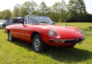
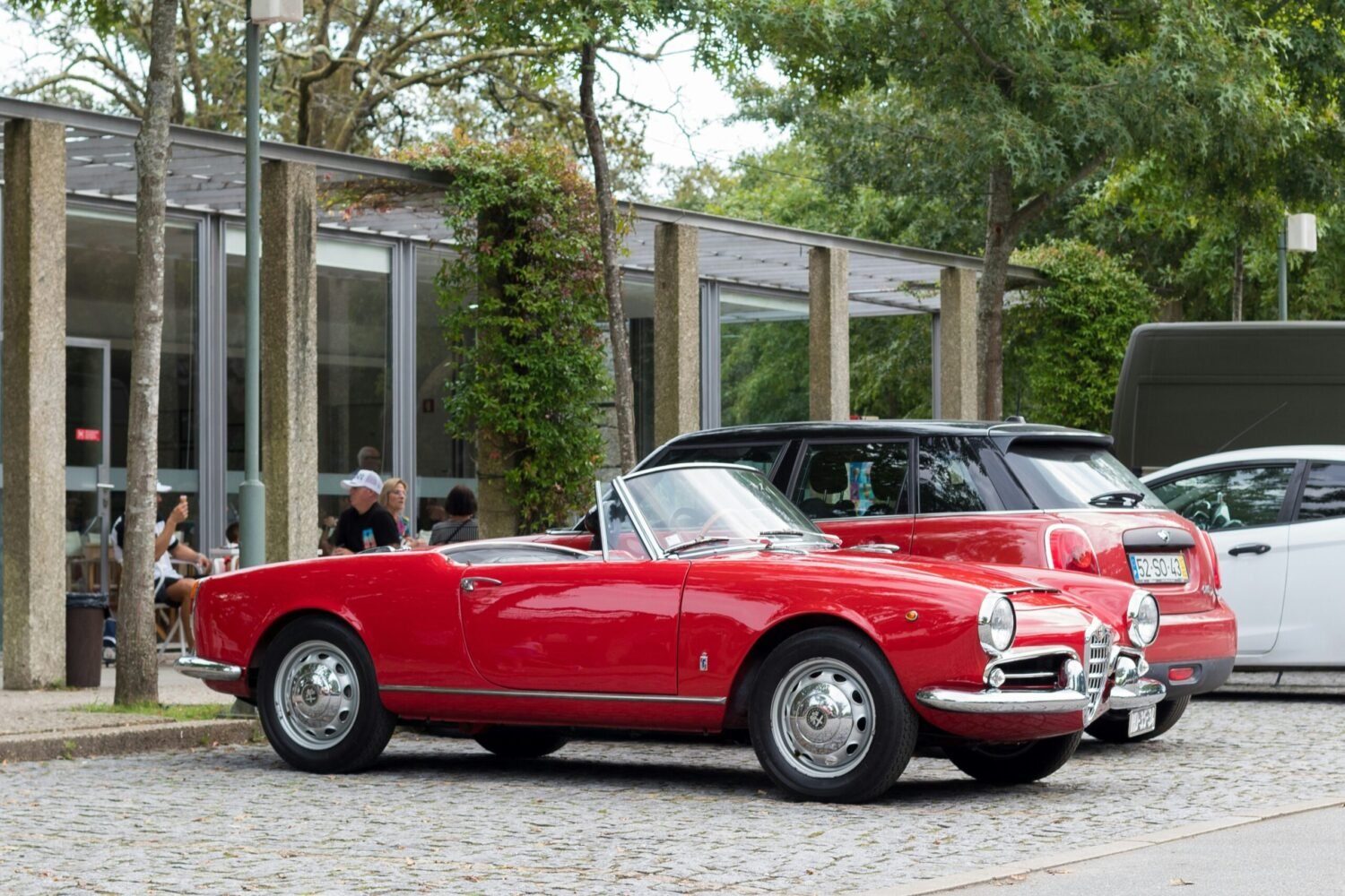
Italy became a republic in 1946, and the Savoy knots — a reference to the old monarchy — were quietly dropped from the badge. Through the 1950s and 1960s the design was gradually simplified and modernised, but the essential pairing of cross and serpent never wavered.
1972: goodbye, “Milano”
One of the biggest changes came in 1972. As Alfa Romeo opened its new plant at Pomigliano d’Arco near Naples to build the Alfasud, the cars were no longer made solely in Milan — so “MILANO” disappeared from the badge. The result was the clean dark ring reading simply “ALFA ROMEO,” a look that defined the brand for a generation.
The modern badge
With the launch of the Giulia in 2015, Alfa Romeo introduced a flatter, simplified emblem for the digital age. The laurel and the older lettering gave way to a cleaner ring, but the heart of the badge stayed exactly where it had always been: the cross of Milan and the Visconti serpent, side by side.
What the two symbols mean
In short: the red cross on white comes from the flag and coat of arms of Milan, while the Biscione — the serpent shown with a human figure at its mouth — is the heraldic emblem of the Visconti, the medieval lords of the city. That figure has been interpreted variously as a Moor, a Saracen, or a child, and the serpent’s colour and styling have shifted across the badge’s many versions \u2014 including the answer to what colour the serpent in the Alfa Romeo logo is. For the full story of the symbols themselves, see our guide to the history and meaning of the Alfa Romeo logo.
Wear the heritage
For Alfisti, that badge isn’t just history — it’s identity. You’ll find it on our Quadrifoglio fender emblems, our logo keychains, and the Scudetto emblem t-shirt — small ways to carry more than a century of Milanese passion with you.