Introduction: The Heart of an Italian Legend
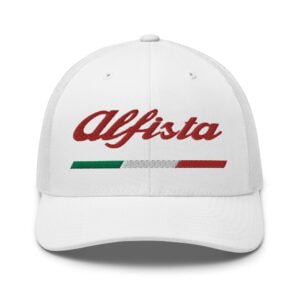
For Alfisti, the passionate devotees of Alfa Romeo, the brand’s logo is more than a mere emblem—it’s a badge of honor that encapsulates over a century of Italian automotive excellence. Founded in Milan in 1910, Alfa Romeo has carved a unique niche in the automotive world, renowned for its motorsport triumphs, elegant designs, and an unmistakable Italian flair that stirs the soul. The logo, with its red cross and Biscione serpent, is a visual testament to this legacy, embodying the brand’s deep ties to Milan and its relentless pursuit of performance. In this comprehensive exploration, we uncover the meaning behind the Alfa Romeo symbol, trace its evolution through time, and celebrate what makes Alfa Romeo a cherished icon for enthusiasts worldwide.
The Meaning of the Alfa Romeo Symbol
The Alfa Romeo logo is a masterful fusion of two historic symbols that anchor the brand to its Milanese roots, each carrying profound historical and cultural significance.
The Red Cross: Milan’s Emblem
The left half of the logo features a red cross on a white background, the official flag of Milan. This symbol traces its origins to the medieval period, likely linked to the Crusades when Milanese soldiers wore similar crosses as a sign of their Christian faith. Some sources suggest it may represent the Cross of St. Ambrose, Milan’s patron saint, or St. George’s Cross, both emblematic of the city’s heritage. For Alfa Romeo, the red cross signifies its unbreakable bond with Milan, the city where the company was born as A.L.F.A. (Anonima Lombarda Fabbrica Automobili) on June 24, 1910.
The Biscione Serpent: Visconti’s Legacy
On the right, the logo showcases the Biscione, a green serpent devouring a human figure, which is the heraldic emblem of the Visconti family, who ruled Milan from the 13th to the 15th century. The serpent, often mistaken for a dragon, is a powerful symbol of strength and victory. Its origins are tied to a legend in which a Visconti ancestor defeated a man-eating dragon terrorizing Milan, cementing the family’s legacy (1000logos.net). The human figure, typically depicted as a Moor or child, represents the defeated foe, possibly from the Crusades. A crown atop the serpent commemorates the Viscontis’ elevation to dukedom in the 15th century, adding regal prestige to the emblem (Aristocrat Motors).
The Circular Badge: Unity and Nobility
These symbols are encased in a circular badge, originally framed in dark blue, a color associated with aristocracy and royal blood, fitting for a brand that exudes elegance and performance. The words “ALFA ROMEO” at the top and “MILANO” at the bottom, separated by two Savoy knots in early designs, complete the logo, reinforcing the brand’s Milanese identity and its evolution from A.L.F.A. to Alfa Romeo under Nicola Romeo’s leadership in 1915 (Alfa Romeo UK).
Together, the red cross and Biscione create a logo that is both heraldic and modern, symbolizing Alfa Romeo’s roots in Milan’s history and its ambition to conquer the automotive world. For Alfisti, it’s a visual reminder of the brand’s storied past and its promise of exhilarating driving experiences.
Evolution of the Alfa Romeo Logo: A Journey Through Time
Since its creation in 1910, the Alfa Romeo logo has undergone numerous transformations, each reflecting the brand’s milestones, design trends, and evolving identity. Designed by illustrator Romano Cattaneo, inspired by the Biscione on Milan’s Castello Sforzesco, the logo has remained true to its core elements while adapting to the times. For a closer look at how the badge changed in each era, see our deep dive into Alfa Romeo badge history, and find out exactly what colour the serpent in the Alfa Romeo logo is.
1910-1915: The Birth of a Legend
The original logo, crafted in 1910, was a circular badge divided into two halves: the left featuring the red cross on white, and the right displaying the green Biscione on light blue. A dark blue ring framed the design, with “ALFA” at the top and “MILANO” at the bottom in silver lettering, separated by two Savoy knots, a nod to Italian heraldry. This logo, designed by Cattaneo in collaboration with chief engineer Giuseppe Merosi, established Alfa Romeo’s Milanese identity from the outset.
1915-1925: Refinement Under Nicola Romeo
In 1915, after Nicola Romeo took control, the company was renamed Alfa Romeo, and the logo was updated to reflect this change. The word “ROMEO” was added, forming “ALFA-ROMEO” in gold-outlined lettering, with “MILANO” retained at the bottom. The cross and serpent were refined for clarity, and the colors intensified, giving the logo a bolder appearance. This period marked Alfa Romeo’s early forays into motorsport, setting the stage for its racing legacy.
1925-1933: Celebrating Racing Triumphs
In 1925, Alfa Romeo’s P2, designed by Vittorio Jano, won the inaugural Automobile World Championship, a milestone celebrated by adding a silver laurel wreath around the badge, symbolizing victory and excellence (Scotti Alfa Romeo). The wreath, inspired by classical triumphs, elevated the logo’s prestige, resonating with Alfisti who revered the brand’s racing prowess.
1933-1946: Golden Glory
The laurel wreath was changed to gold in 1933, enhancing the logo’s visual impact. The red cross and lettering were enlarged, and the color contrast was strengthened, reflecting Alfa Romeo’s growing prominence in motorsport, including four consecutive Le Mans victories from 1931 to 1934.
1946-1947: Post-War Simplification
After World War II, the logo was simplified due to resource constraints. The laurel wreath was replaced by a medium-thick silver circle, and the design was streamlined for a modern look, reflecting the brand’s resilience during challenging times.
1947-1948: A Brief Color Shift
In 1947, the logo adopted a red and yellow palette with a thin gold frame, and the hyphen in “Alfa Romeo” was removed. This short-lived design was an experiment in post-war optimism but was quickly reverted.
1948-1950: Return to Tradition
By 1948, the logo returned to its traditional colors, with spaced “ALFA ROMEO” lettering, a green snake with a black outline, and a red human figure. The red cross was detailed with an outline, maintaining the logo’s heraldic roots.
1950-1971: A Rounder Design
From 1950 to 1971, the logo became rounder, with a larger snake and a geometric human silhouette. “MILANO” remained in a delicate font, and the design balanced tradition with modernity, appearing on iconic models like the Giulietta and Giulia.
1971-1972: Expanding Beyond Milan
In 1972, with the opening of the Pomigliano d’Arco Alfasud plant, “MILANO” was removed from the logo, reflecting Alfa Romeo’s expansion beyond its hometown. Black outlines were changed to gold, and a thin gold outline was added, signaling a new era of national and international growth (Alfa Romeo Canada).
1972-2000: Modernization
The 1972 logo introduced a darker blue background, yellow outlines, and a bold, geometric sans-serif typeface for “ALFA ROMEO.” This modernized design, used until 2000, aligned with contemporary trends and appeared on models like the Alfasud and 33.
2000-2015: Embracing Gradients
In 2000, the logo adopted gradient shades, giving it a three-dimensional effect. The cross background shifted to light blue and white, and the lettering transitioned from silver to gold, reflecting early 2000s design aesthetics. This logo adorned models like the 147 and 159.
2015-Present: A Contemporary Classic
Launched on June 24, 2015, during Alfa Romeo’s 105th anniversary and the unveiling of the new Giulia, the current logo features silver details, a unified silver background, and the red cross and green snake touching, creating a cohesive and modern look. The design emphasizes geometry and proportion, maintaining the logo’s elegance (Alfa Romeo Canada).
2025: The 115th Anniversary Logo
In April 2025, Alfa Romeo unveiled a commemorative logo to celebrate its 115th anniversary, coinciding with the anniversaries of Tazio Nuvolari’s 1930 Mille Miglia victory and the Quadrifoglio’s 1923 Targa Florio debut (Stellantis Media). The logo features the number “115” in an ascending diagonal, with the “5” embraced by the Biscione serpent, set against a deep black and Alfa red contrast. This design symbolizes the brand’s momentum and innovation, shared with official clubs and Alfisti for events and rallies (ClubAlfa Global). While a temporary emblem, it underscores Alfa Romeo’s enduring legacy and forward-looking vision.
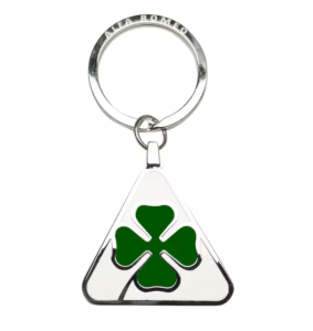
The Quadrifoglio: A Symbol of Luck and Performance
Though not part of the main logo, the Quadrifoglio (four-leaf clover) is an iconic symbol in Alfa Romeo’s history, particularly for its high-performance models. Introduced in 1923 by driver Ugo Sivocci, who painted it on his RL for luck before winning the Targa Florio, the Quadrifoglio became a talisman for the brand. Since then, it has adorned Alfa Romeo’s sportiest vehicles, from the Giulia Quadrifoglio to the Stelvio Quadrifoglio, symbolizing luck, performance, and the thrill of the racetrack. For Alfisti, the Quadrifoglio is a mark of excellence, representing the pinnacle of Alfa Romeo’s engineering.
Why Alfa Romeo Stands Out
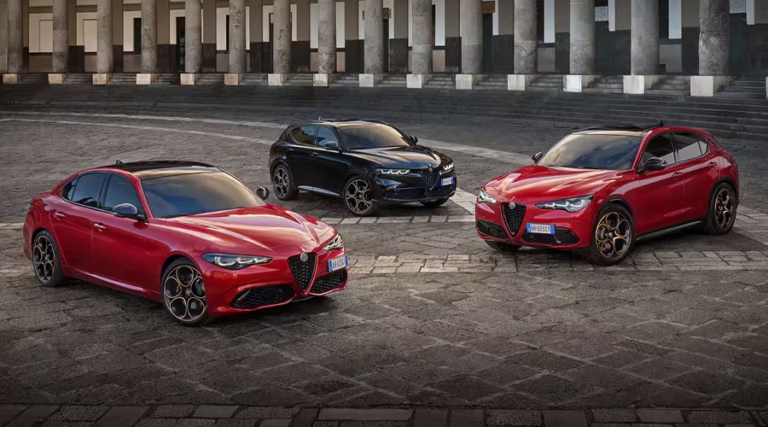
Alfa Romeo’s uniqueness lies in its blend of motorsport dominance, exquisite design, and Italian passion, setting it apart from other automotive brands. Since its early days, Alfa Romeo has been a force in racing, winning the first two Formula 1 World Championships in 1950 and 1951 with drivers Nino Farina and Juan Manuel Fangio, and securing 10 Targa Florio victories. Models like the 8C 2300, Giulietta, and modern Giulia combine performance with aesthetic elegance, earning accolades like the 1998 and 2001 European Car of the Year awards for the 156 and 147, respectively.
Unlike mass-market manufacturers, Alfa Romeo prioritizes driving pleasure and emotional connection, a trait cherished by Alfisti. Its Italian heritage infuses every vehicle with a sense of artistry, from the “Trilobo” grille to the soulful roar of its engines. Even as the brand embraces electrification with models like the Junior Elettrica, it remains committed to its core values, ensuring that each car feels distinctly Alfa Romeo.
Significance for Alfisti: A Badge of Passion
For Alfisti, the Alfa Romeo logo is a symbol of their unwavering devotion to a brand that transcends mere transportation. It represents the thrill of driving a car designed with passion, the pride of owning a piece of Italian history, and the camaraderie of a global community united by their love for Alfa Romeo. The logo’s evolution—from the original 1910 design to the 2025 anniversary emblem—mirrors the brand’s journey through triumphs and challenges, resonating with enthusiasts who see themselves as part of this legacy.
The red cross and Biscione evoke memories of Alfa Romeo’s racing victories, from the P2’s 1925 championship to Nuvolari’s Mille Miglia dominance. The Quadrifoglio stirs excitement for the brand’s high-performance models, while the logo’s modern iterations reflect Alfa Romeo’s adaptability in a changing automotive landscape. Whether displayed on a vintage 6C or a contemporary Tonale, the logo is a constant reminder of why Alfisti remain loyal: Alfa Romeo is not just a car—it’s a way of life.
Conclusion: An Enduring Emblem of Excellence
The Alfa Romeo logo is a timeless symbol that weaves together Milan’s rich history, the brand’s racing heritage, and its commitment to Italian style and performance. From its origins in 1910 to the commemorative 115th anniversary logo in 2025, it has evolved while preserving its core elements, much like the cars it represents. For Alfisti, the logo is a source of pride, a visual embodiment of their passion for a brand that continues to inspire with every curve of the road. As Alfa Romeo looks to the future, its logo remains a beacon of its storied past and a promise of exhilarating journeys ahead.
Table: Evolution of the Alfa Romeo Logo
| Year Range | Key Changes | Significance |
|---|---|---|
| 1910-1915 | Red cross and Biscione in a blue-framed circle, “ALFA” and “MILANO” with Savoy knots | Established Milanese identity for A.L.F.A. |
| 1915-1925 | Added “ROMEO,” gold-outlined lettering, refined cross and serpent | Reflected renaming to Alfa Romeo |
| 1925-1933 | Silver laurel wreath added | Celebrated 1925 World Championship win |
| 1933-1946 | Gold wreath, enlarged cross and lettering | Enhanced visual impact during racing dominance |
| 1946-1947 | Wreath replaced by silver circle | Post-war simplification |
| 1947-1948 | Red and yellow palette, no hyphen in “Alfa Romeo” | Brief experimental design |
| 1948-1950 | Returned to traditional colors, detailed snake and cross | Restored classic look |
| 1950-1971 | Rounder design, larger snake, geometric human | Balanced tradition and modernity |
| 1971-1972 | Removed “MILANO,” gold outlines | Reflected expansion beyond Milan |
| 1972-2000 | Darker blue, yellow outlines, bold typeface | Modernized for contemporary trends |
| 2000-2015 | Gradient shades, light blue cross background | Embraced 2000s design aesthetics |
| 2015-Present | Silver details, unified background | Modern, cohesive look for 105th anniversary |
| 2025 | Commemorative 115th anniversary logo with “115” and Biscione | Celebrated heritage and future vision |